A PhD thesis is a big book that you must submit in order to get three letters at the end of your name. It’s a big effort. Here’a a link to my thesis.
Let’s think about the number of words that we would expect to see in the document during the time it is being written. A really good student might look something like this:
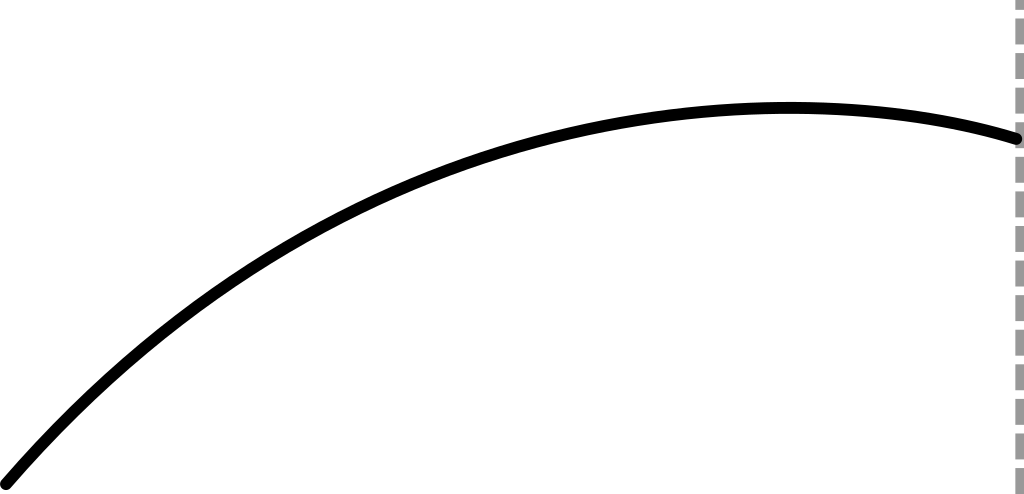
They write a bunch of stuff, and slow down towards the deadline, even taking the time to edit and reduce the wordcount! A bad and lazy student, on the other hand, might be expected to produce a curve more like this:
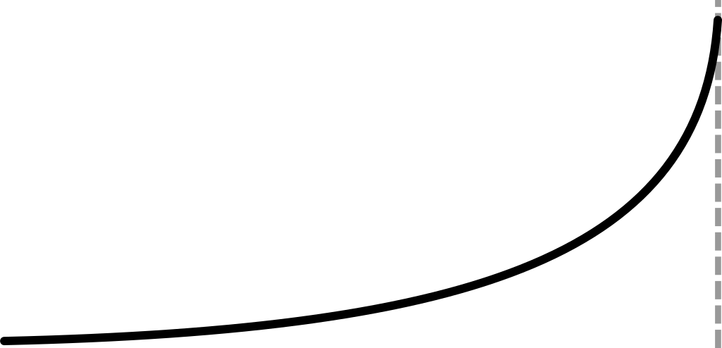
Cramming at the last minute, racing towards the deadline. I was absolutely sure that I would be in the latter camp, no matter how much I aspire to the former.
So I was pretty surprised when the data came out like this:
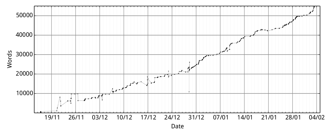
Pretty linear! I didn’t expect that at all.
What’s especially bizarre is that about halfway through, I realized that the code I was using to keep track of progress was over-estimating by a factor of two — that’s the big spike in the middle of the graph. I nearly lost my mind when I realized the screw-up, but you can see that it had negligible effect on the actual rate of progress.
If you are writing a PhD thesis or other such document I can’t promise that your profile will be the same as mine. I can reccomend taking regular walks and staying calm.